Have you ever noticed the small interactions you have with a digital device, like clicking a button or swiping an icon? These are called microinteractions, and they are the building blocks of a great user experience. Microinteractions can delight your users by providing those 'little touches' that make your designs stand out. These dynamic interactions can have a significant impact, so it's important to understand them fully. That's where we come in! In this post, we'll examine what microinteractions are, why they're so important, and share some actionable advice on when (and how) to incorporate them into your designs. What is a microinteraction?

At its core, a microinteraction is a small interaction between a user and a digital product that serves a specific purpose. Microinteractions usually occur when a user triggers an action that results in a response.
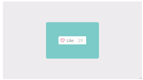
Think about hitting the “like” button on social media platforms. The button might change color or move up and down. This not only confirms that your action was recorded but also shows other users that the content is popular.
Even though they might seem small, microinteractions improve the overall user experience by providing feedback, informing users of their actions (or even influencing their behaviors), and bringing the interface to life with dynamic animation. With clear, accessible, and intuitive interactions, users are more likely to feel a sense of accomplishment and engage with the product.
The four components of microinteractions
Microinteractions consist of four components: the trigger, the rules, the feedback, and the loops and modes. Let’s take a closer look at each.
1. Trigger
The trigger is the moment when the microinteraction begins. There are two types of triggers:
-
Explicit, which are user-initiated (like hitting the like button, as we explored in the previous section), and
-
Implicit, which are system-initiated—like displaying a notification or automatically updating information based on a predefined condition.
The key to creating effective triggers is making them clear, visible, and intuitive, so users understand what action they need to take to initiate the interaction.
2. Rules
Rules are a set of conditions that determine how the interaction will behave. They guide how the system responds to the trigger, including displaying a message, playing a sound, animating an element, or updating data. The rules also define the interaction constraints (i.e., what the users can or can’t do) and provide helpful hints when those constraints are met—for example, an error message indicating that a password requires special characters.
3. Feedback
Feedback provides users with a visual or auditory response to their actions—informing users about the outcome or status of their action and confirming their input has been recognised. Feedback can take a range of different forms, from visual cues like changes in colour or shape, to progress indicators or sound effects.
4. Loops and modes
Loops and modes define what happens during and after the microinteraction. Loops refer to the continuous feedback or animation that occurs while the microinteraction is taking place, giving users a sense of continuity and progress.
Modes, on the other hand, define the different states or variations of a microinteraction that can exist depending on the context or user behaviour. Together, loops and modes help to create a more dynamic and personalised experience.
What are the benefits of using microinteractions? How can they improve your UI?
As we’ve explored so far, microinteractions are a small but mighty addition to any user interface—bringing the design to life and enhancing the overall user experience tenfold. Let’s explore five benefits of incorporating microinteractions into your upcoming project.
Increased user engagement
Through responsive, dynamic animations, microinteractions provide instant feedback, which brings the interface to life. They create a sense of direct manipulation and engagement, which keeps users engaged—and encourages them to explore the UI further.
Clear communication and feedback
Microinteractions help convey information concisely and intuitively, reducing ambiguity and keeping users in the loop. For example, a loading spinner during a file upload process assures users their action is being processed. By providing real-time feedback, microinteractions improve transparency across the board (one of the key pillars of good UX).
Guidance and learning
Microinteractions can guide users, reinforce their actions, and help them understand how to navigate the UI effectively. By providing visual cues and subtle animations, they shape user behaviour and teach them the expected workflow. For example, a subtle highlight effect when hovering over a clickable element lets the user know it’s interactive—which encourages them to interact.
Enhanced emotional connection
Despite being…well, micro—microinteractions can evoke emotional responses from users. Whether it’s subtle animations, delightful transitions, or playful interactions, microinteractions can add personality and character to your UI, making the interface feel more relatable and fostering a sense of connection and empathy with your audience.
Error prevention
By providing immediate and contextual feedback, microinteractions keep user errors to a minimum and help users quickly resolve issues when they do happen. For example, when users enter invalid data into a form, a microinteraction could highlight the problematic input in red, quickly helping users identify and correct the error. This also reduces users’ frustration and friction, resulting in a more seamless user experience overall.
What are the different types of microinteractions? (With examples)
In reality, there’s no set or exhaustive list of microinteractions. Each microinteraction looks different, and as technology (and UI design) evolves, new types of microinteractions crop up. Despite this, there are a few core types of microinteractions you’ll recognise from the interfaces you know and love.
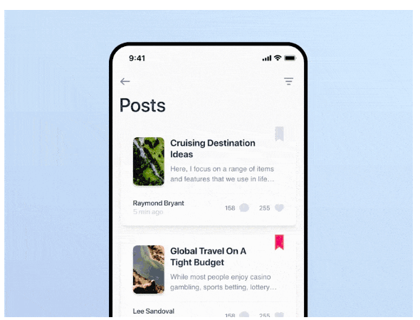
- Tap effects refer to animations or visual changes when users tap on a clickable element (like a button). They provide immediate feedback to acknowledge the user’s action.
[Via WebArtDevelopers]
-
Swipe effects involve animations or transitions that respond to a swipe gesture, typically used when navigating through screens or images to guide users through the content
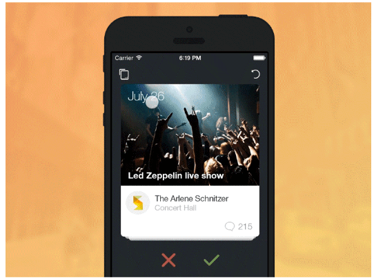
[Via Cem Kazim]
- Tap and hold effects happen when a user taps and holds on an element, triggering a specific action or revealing additional options. These are particularly useful for showing hidden functionalities or providing access to secondary actions.
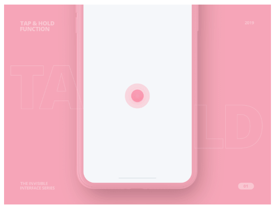
[Via Dribbble]
-
Scroll-into-view microinteractions come into play when users scroll through a page or list. These animations can bring elements into view or include subtle transitions that indicate the user’s position within the content.
-
Pull-to-refresh microinteractions allow users to refresh the content by pulling or dragging the screen downward—providing a tactile and visually engaging way to update information.
[Via Dribbble]
- Progress bars visually represent task completion or the loading status. They provide users with a clear sense of progress and reassure them that their action is being processed.
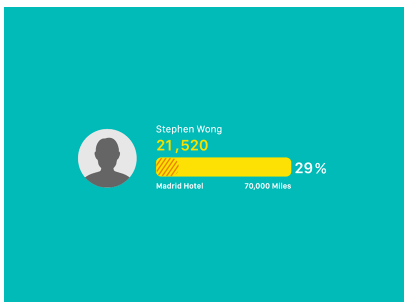
[Via Dribbble]
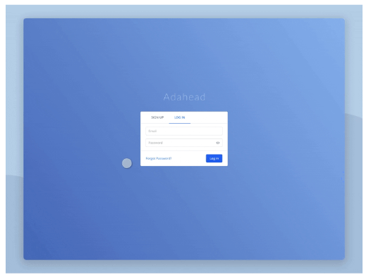
- Microinteractions related to errors occur when users make mistakes or encounter issues. These interactions can include visual cues, animations, or error messages that highlight the problem and guide users toward resolving it.
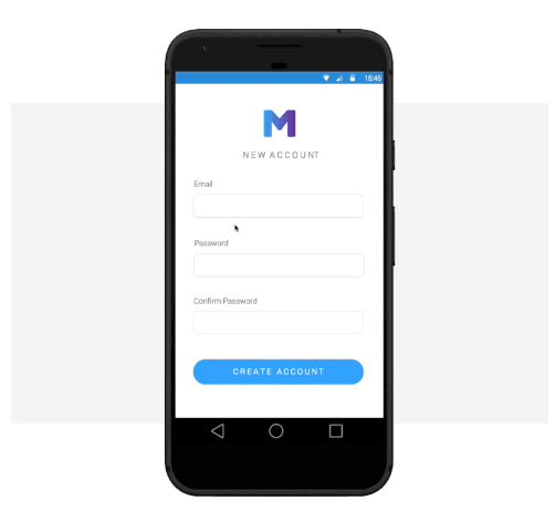
[Via Justinmind]
-
Sound-based microinteractions involve using audio feedback to enhance user interactions—including subtle sounds that accompany actions like button clicks or notifications.
-
Button state changes visually differentiate a button’s states, depending on whether it’s active, hovered, or disabled. These interactions help users understand the button’s current state.

[Via Cloud Four]
- Hover effects are the result of users moving the cursor over interactive elements. These microinteractions can include animations, colour changes, or tooltips that provide additional information or context.
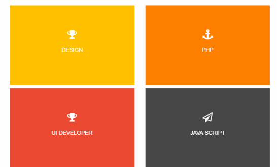
[Via CodeMyUI]
-
System feedback microinteractions provide visual or audio feedback related to system actions or processes, like saving, deleting, or syncing data.
-
Page transitions occur when users navigate between different screens or pages. They can involve animations, fades, or sliding effects.
[Via Dribbble]
How to Design Microinteractions
To seamlessly integrate microinteractions into your interface, follow these five practical steps:
-
Identify the Interaction Point
Begin by pinpointing the specific interaction point within the user interface where the microinteraction will occur. This could be a button, form field, notification, or any element where user input triggers a response. Clearly define the purpose and desired outcome of the microinteraction once the interaction point is identified. -
Define the User Flow
Consider the steps users will take before and after the interaction. Conduct user research to understand the context, user goals, and potential challenges. This step is crucial for understanding the role of microinteractions within the user experience and how they assist users in completing actions. -
Sketch the Interaction
Create quick sketches or wireframes to visualize how the microinteraction will function. Consider the motion, animations, and visual cues that will communicate the interaction to the user. Iterate and refine your sketches until satisfied. -
Prototype and Test
Bring your microinteraction to life by prototyping it using design tools like Adobe XD, Figma, or Principle. These tools offer advanced prototyping capabilities to create dynamic, interactive prototypes that simulate the microinteraction. Test the prototype with real users and refine it based on their feedback. -
Implement the Microinteraction
Once the design is validated through user testing, integrate the microinteraction into the final product. Collaborate with developers on the specifications and assets required to ensure the interaction behaves as intended.
Using Microinteractions in UI Design: Tips and Best Practices
To create effective microinteractions, consider these best practices:
-
Keep it Simple and Purposeful:
Microinteractions should be lightweight and unobtrusive, avoiding unnecessary complexity or excessive animations. Focus on delivering a clear and concise message that guides users without causing confusion. -
Pay Attention to Timing and Feedback:
Timing is crucial for effective microinteractions. Consider the speed, duration, and sequencing to ensure they feel natural and intuitive. -
Stay On-Brand:
Consistency is key in microinteractions, helping establish familiarity and build trust with users. Maintain a cohesive design language, ensuring colors, typography, and motion patterns align with the rest of your interface.
Final Thoughts
Microinteractions, from small touches that enhance an experience to essential feedback loops that guide users, can transform your design and create a more enriching user experience. By incorporating microinteractions, you can help users complete tasks more efficiently, leading to better engagement and higher revenue. When designed well, microinteractions can also have a greater emotional impact, helping users connect more deeply with your product or service.